
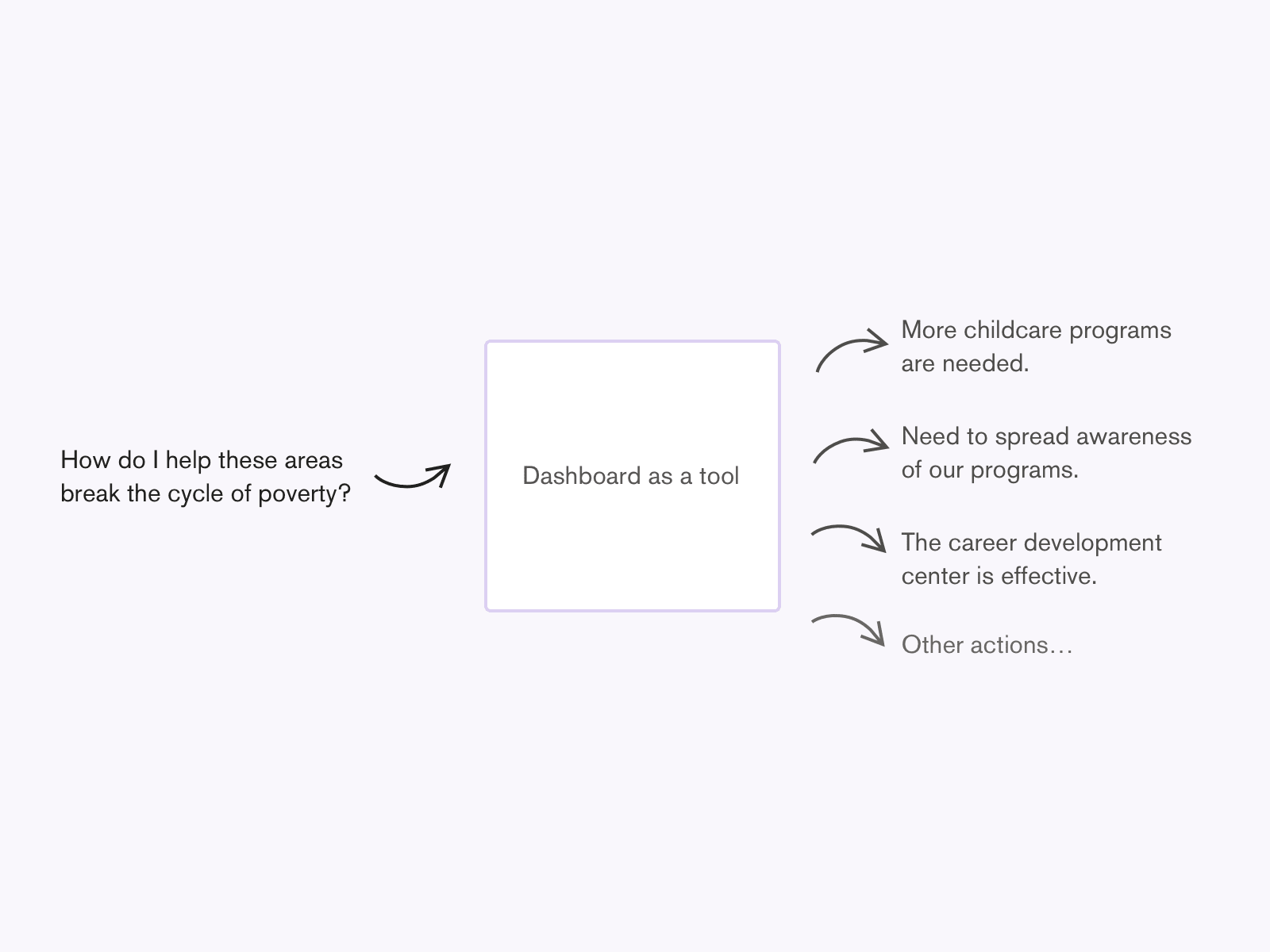
Unless a dashboard is a landing page, no one will visit a dashboard for fun. Dashboards are a tool to support decision making, monitoring, or solving a problem. Each component of the dashboard needs to have a clear reason why it’s there and how it helps the user perform a task or do a job. A high-level view of the user flow looks like this:
- The user has a job to do, like make an informed decision, monitor an existing landscape, answer a specific question, etc.
- The user views a specific dashboard that they believe will help them do their job
- The user spends time interpreting and consuming the data
- The user uses that data to complete their job
Creating a dashboard layout
When creating a dashboard layout, consider the following validated assumptions:
-
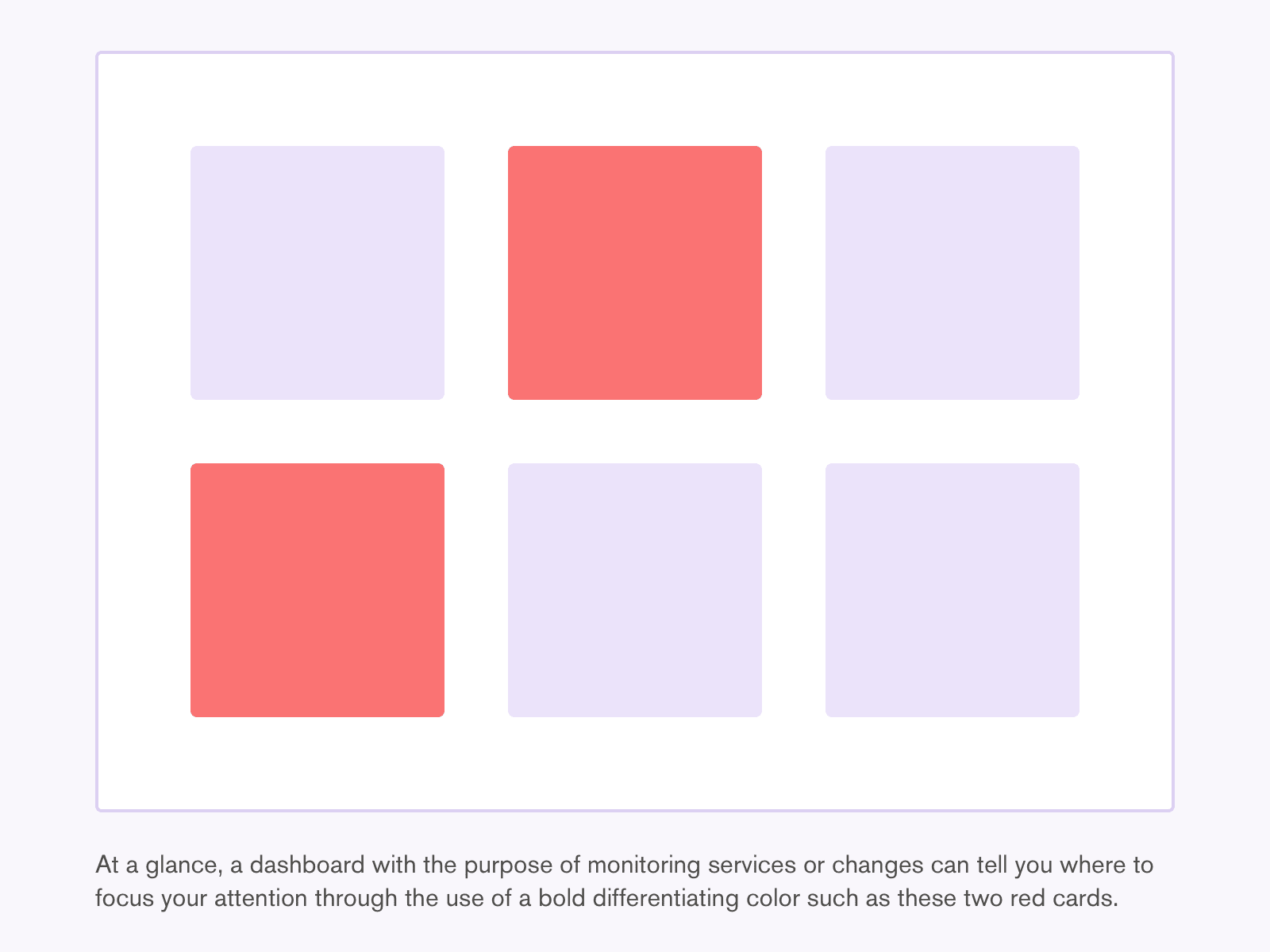
Users want to know “How am I doing?” almost immediately because that is the primary value of a dashboard. They want to know where to focus their attention and where they are performing well.
-
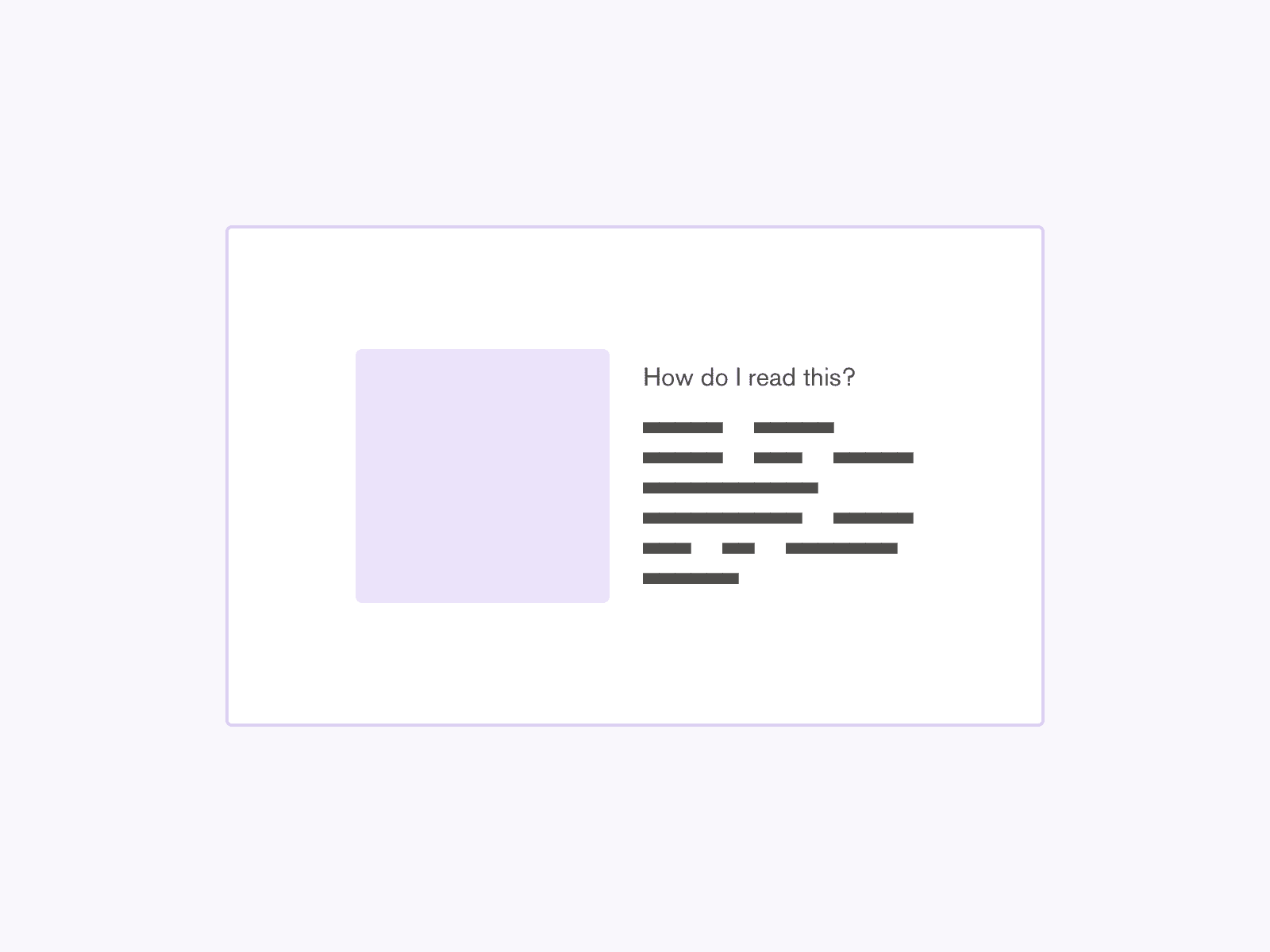
Users will always ask, “What does this mean?” when they see a number. Consider providing a narrative, such as a “How do I read this?” alongside any chart or other metrics.
-
Users are overwhelmed by a long page of charts. The maximum number of components for a single dashboard should correspond to the user's maximum cognitive load. The dashboard should be consumed and read as a whole; overloading makes it harder to consume.
-
Showing multiple views per card can be easily done with tabs. However, flipping back and forth between tabs on charts can hinder the user’s ability to synthesize the data.
Think beyond the entry and exit of the dashboard
When thinking about a dashboard, consider the bigger picture:
- A dashboard is a tool to perform a job, not the end goal. A dashboard exists to assist or support, and its success and continued use will be determined by how well it helps the user achieve a primary goal or job. Additionally, a successful dashboard can motivate the user to advocate for better or consistent data collection on which the dashboard relies.
- Notify the user when there is a change. Respect their time. Users appreciate being told when it’s time to view the dashboard—for example, when there is updated data or when a metric has reached a threshold. Do not expect them to be constantly refreshing the dashboard, which takes up valuable time in their busy lives.
Working with data
When working with data, consider the following:
- Data is not an insight. At least two data points, but ideally more, are needed to derive an insight. Product manager Jason Amunwa gives this illustrative example: a single data point looks like “382 people visited the website today,” which has no insight nor context; combining two data points looks like “382 people visited the website today, which is 41% higher than normal,” which is better, but does not explain why; adding another data point looks like “382 people visited the website today, which is 41% higher than normal, due to an increase in traffic from formidable.com,” which provides enough context to not only show the difference but explain it.
- Visualizing or presenting data is only as good as the quality of the data itself. Design cannot compensate for low quality data. Poorly collected or cherry-picked data cannot give an accurate representation of reality. Low quality data can be used to make the wrong decisions that negatively impact lives; it can be confusing and unhelpful in decision making, taking action, or doing a job.
- Data is inherently imperfect. As Giorgia Lupi eloquently puts it, “Data is an instrument that we human beings created to observe, record, and archive our reality. It’s a partial abstraction of reality—a proxy for something else—but it’s never the real thing.”
In summary
Writer Derek Sivers points out, ”If more information was the answer, then we'd all be billionaires with perfect abs.” Creating a useful dashboard is not about dumping information on someone and leaving them alone to figure it out. A useful dashboard has a specific purpose in mind to help the user solve a specific problem or complete a specific task. Each component of the dashboard has a clear reason in fulfilling that purpose. Each data point is not made available only because it's possible to do so, but instead, it is connected with other data points to provide more valuable and meaningful statements. A useful dashboard is a tool to assist the user to go do something else; it is the ever-patient sidekick ready to help with the next big decision.
References
- The Visual Display of Quantitative Information by Edward Tufte https://www.edwardtufte.com/tufte/books_vdqi
- Giorgia Lupi: Finding Humanity in Data https://vimeo.com/343057865
- 7 Rules for Designing Better Analytics Dashboards by Jason Amunwa https://www.vandelaydesign.com/designing-analytics-dashboards/
- Dashboards: decision displays https://www.edwardtufte.com/bboard/q-and-a-fetch-msg?msg_id=00002r
- Why analytics tools still suck (and how to improve them) by Jason Amunwa https://jasonamunwa.com/blog/better-analytics-tools-goldmine/
- 10 Rules for Better Dashboard Design by Taras Bakusevych https://uxplanet.org/10-rules-for-better-dashboard-design-ef68189d734c
- Top data visualizations examples and dashboard designs by Shane Ketterman https://uxdesign.cc/top-data-visualization-examples-and-dashboard-designs-9465e9a519b
- Ryan Singer’s answer to User Interfaces: What purpose does a Dashboard within a Product serve? by Ryan Singer https://www.quora.com/User-Interfaces/What-purpose-does-a-dashboard-within-a-product-serve/answer/Ryan-Singer?srid=3YiD&st=ns